2025.07.04 Chartstorm
Asset prices signals an all clear. Economic data is mixed. Good or bad? You will find both. PICK YOUR POISON.
Purpose:
"Chartstorm" is designed as an unfiltered stream of visual data, offering a unique perspective on global markets, with a primary focus on equities and G10 FX. My approach is to present a multitude of charts with minimal commentary, in an unstructured and chaotic manner, highlighting what I personally find most interesting.
Goal:
My hope is that these visual cues will serve as a powerful springboard for your own analysis. By exposing you to diverse data in a raw format, "Chartstorm" aims to spark new ideas, provide fresh insights, or prompt you to re-evaluate your current trade ideas and investment positions, ultimately enhancing your decision-making process.
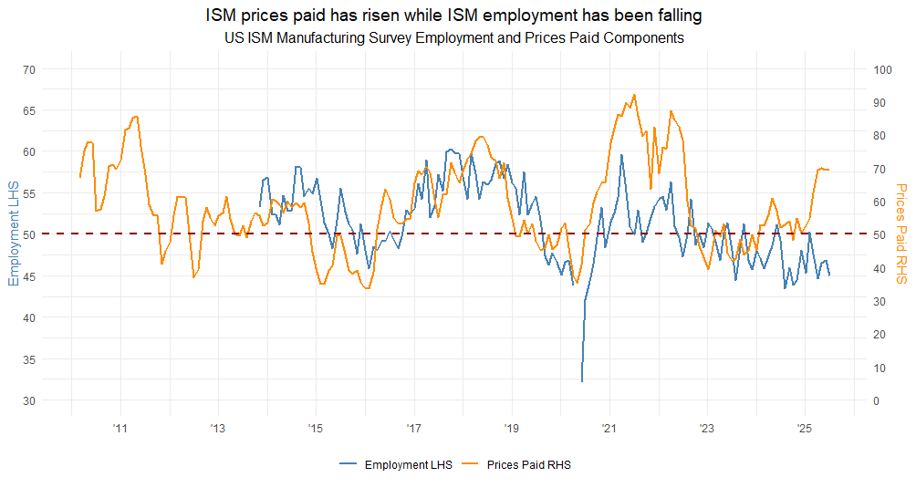
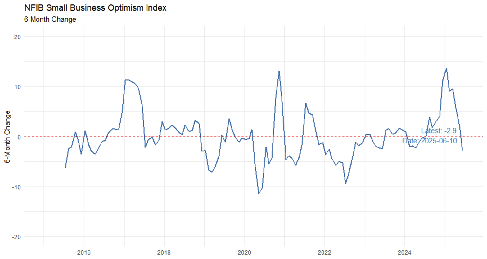
I have been worried about ISM prices stabilizing at a higher level while employment is drifting lower.
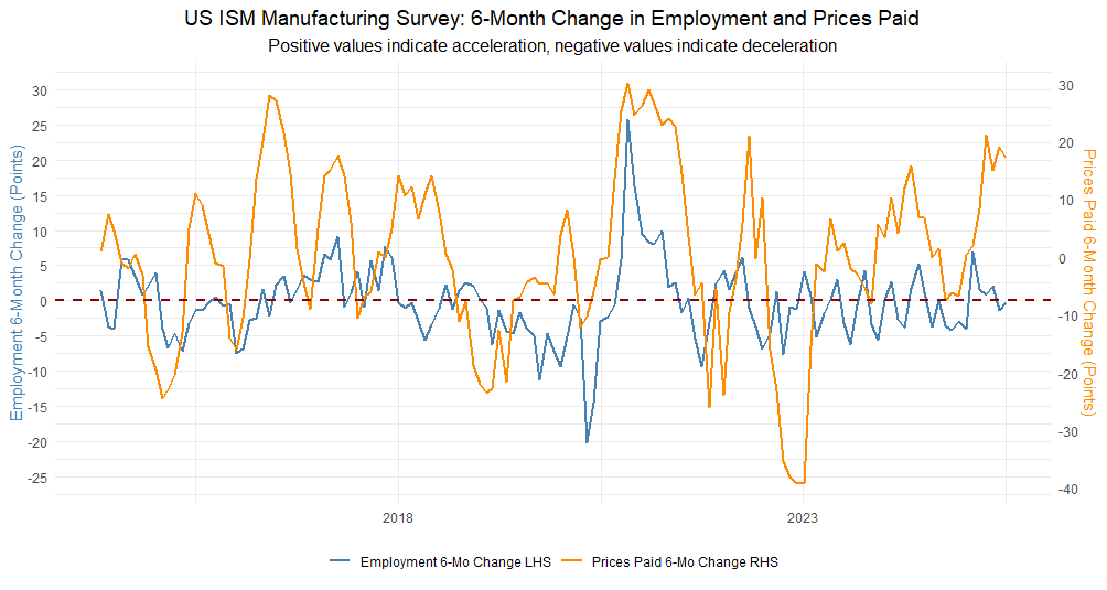
Even more worrisome picture on a 6-month change.
Will this eventually translate into higher CPI?
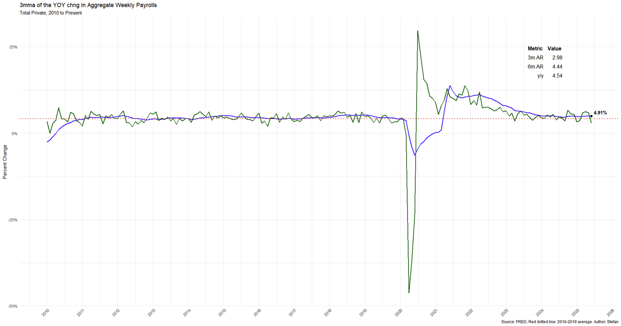
3-month moving average of the year-on-year change in Aggregate Weekly Payrolls is a good gauge of where US Nominal GDP is going.